Friday 19 September 2014

Final Evaluation

Overall Evaluation

I feel that in comparison to other existing magazines and conventions, my cover has a variety of conventions. The conventions that I identified back when I was researching that I feel are clearly on my cover are:
Ø  Mast head
Ø  Main image
Ø  Headline
Ø  Cover lines
Ø  Barcode
Ø  Secondary image
Ø  House-style
Ø  Punctuation

I am happy with the overall outcome of my magazine, as I feel it is easily recognised as a magazine cover because I have used the correct conventions and have considered the Gutenberg diagram theory when editing and have tried to make conscious decisions in the positioning of objects on the page.

I think if I were to do the cover again then I would have taken the main image picture at a different angle, as there isn’t a real focus on the front cover, unlike other covers that I analysed (Vogue). The problem I faced was that the masthead covered too much of the main image than I intended and ended up covering the models head and I didn’t feel that layering the model on top of the masthead would be a good decision due to the magazine not being well-known enough yet. I did attempt to edit it on Adobe Photoshop, but I couldn’t work the software completely without some part of the cover deleting. That is another thing I would change if I were to do it again; I would get some knowledge of Adobe InDesign, as I started to use it but couldn’t get to grips with it due to never having used the software before. In the end I ended up using Microsoft Publisher to put my magazine cover together as I know the program well and it was also the only software that I could easily access both at school and at home, where I spent the majority of my editing time.
I feel like I made the right decisions with my cover lines, as they’re relatively vague when looking at other existing magazine covers, but that’s due to the target audience and the purpose of my magazine, as it is completely different to others.

I spent the majority of my time planning and looking at existing magazine covers to understand the conventions made up on a cover. The most useful piece of research that I did was the ‘Readership Profile’ as I could see why other magazines are popular and who their primary target audience is and how they adapt their covers for them. Also, speaking to my target audience was extremely beneficial as it gave me building blocks to think of the headline and cover lines that feature on my cover. It also helped that I am a part of the target audience age range as it meant I could also use my logic in the editing. An example of this, was when deciding what the main image should be, as it had to appeal to both genders.

I took a variety of pictures for the main image, but reflecting back on the project I could have asked the target audience for their feedback and seen which one they would have rather seen as the front cover, but due to the time scale of the project, I wouldn’t have had enough time to then edit the cover. I do feel that I had enough time to edit my magazine cover, as I already had an idea of what I wanted it to look like due to my mock-up of the cover; due to me having spent less time on taking photos than I probably should have, meant I had time to try out the cover in a number of different ways to see what worked best in my eyes. Again, if I had more time then I would have liked to have the target audiences feedback to then edit it from critic feedback.

One problem I came across during the whole process was the photography for the main image and secondary image. I recently got a new camera and I haven't had the chance to have a play on it and get to grips with how it works. So the project enabled me to do this and start building a photography portfolio. I quickly overcame this problem after taking many pictures that weren't what I intended to take and weren't of the standard that I wanted for the front cover.

Reflecting back on the whole process I think I have produced a worthy magazine cover. I think it is clear who the target audience are and have ensured that they will be interested in reading the magazine. I feel that I understand all of the conventions that make up a magazine cover and why they are recognisable. Other than the previous things I have mentioned, I wouldn’t have changed any other elements in this project, but in the future I definitely would consult the target audience before any decision making to make sure I have made the right decisions.
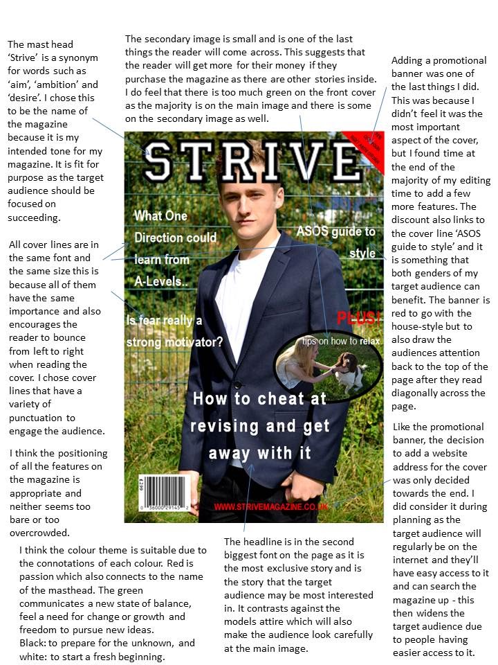
Evaluation - 'Strive' Magazine Cover Annotated

Evaluation - Editing Process


Construction - Magazine Cover


Tuesday 16 September 2014

Planning - Final Design Idea


Final Design Idea

Mast head: Strive


This font isn’t extremely informal or formal. It is a bold masthead making it recognisable.
The world ‘Strive’ is a synonym for words such as ‘determination’ and ‘achieve’. I feel that a positive mast head speaks for the whole tone of the magazine and is a word that should be echoed throughout Sixth Form. It will be in capitals to make it to stand out and also make it seem more official.
The typography is from Dafont.

Headline: “How to cheat at revising and get away with it”
I feel that this headline is light-hearted and witty. It covers an area that my target audience has asked to be covered and that is why I have chosen it to be the headline and not just a cover line.

Cover lines:
  • ASOS guide to style
  • What One Direction could learn from A-Levels
  • Is fear really a strong motivator?
  • “Work to become, not to acquire.”
I’ve chosen to use these four cover lines to include on the magazine as they touch upon areas that my target audience has asked to read about (readership profile). This is why I’ve tried to make the cover lines comical to entice the target audience to read the magazine. The cover lines are also quite vague which should persuade the target audience to read because it is mixed with comedy, as some of the students that I asked in my readership profile mentioned that they wouldn’t want all of the focus to be on education. With these cover lines I don’t feel that the whole focus of the magazine is on revising and exams, as I’ve tried to include some light hearted humour.

Secondary Image: I want to take a photo that is obviously taken away from school. Instead of taking a photo like suggested in previous planning, I have decided to go for more of a relaxed photo, away from school, possibly of a student and their dog. Both at low levels to represent ‘down time’, and being outside. This would follow the cover line: “PLUS tips on how to relax”. Which complements the idea of the secondary photo. I want the student and dog to be looking at each other to show the need to relax, hopefully the target audience will find the dog ‘cute’ which will create a topic to speculate about and then others will look and read the magazine.

Planning - Magazine Cover Ideas


Magazine Cover Ideas

Idea of a main photo
Why it would work
Why it wouldn’t work
Team photo of a football/rugby
From my research fewer boys read magazines than girls, so attracting and convincing boys to read my magazine may be a challenge. Therefore, if the cover is a photo of something the boys will be interested then
The team may have been defeated and therefore won’t want to read it and try and convince others not to read it either.
Students in lesson
It will make it clear to an audience what the magazine is about.
The target audience may think that the magazine is meant to be educational and would seem confusing if the cover lines are witty and not about education.
Idea for secondary image
Individual student achievement
Peers may not know and are interested in achievement. Also teachers may not know that a student has a special talent or hobby outside of school, and as a result everyone is sixth form can get to know each other better.
There may not be anyone who would want it published. And the worst is, that there wouldn’t be achievements every time an issue comes out. For that reason a house-style would be hard to create on the cover.
Future film release
It is modern and can interest anyone in sixth form.
Can’t advertise a rated 18 film as it wouldn’t even attract half of the target audience, and a rated 15 film may not interest the target audience at the higher end of the scale.

Mise-en-scene

Main photo

  •    The image that I end up using will have a model looking at the camera lenses (direct mode of address) so it can build a relationship with the reader. The use of it makes the overall aesthetics of the magazine more attractive and makes it more eye catching.
  •        Background of the shoot will be green scenery, with the model leaning against a fence. This will imply that the photo has taken place on a school location, as fences are most commonly found around the school which will later have connotations.
  •       The model will be a male and he be wearing an outfit that is both smart and casual as it will convey a casual but important theme to the reader. He will wear a white t-shirt, blazer and skinny jeans.
  •            The pose will be a ‘stern’ pose, in which the model will be stood upright, looking directly at the camera, shoulders back with his hands in his pockets. This will reflect the start of a new school year and to also convey that having the right mind set shows that the model is prepared.
  •       The shot will be a mid shot, as when I was researching I rarely came across any magazine that didn't either use a mid shot or close up. This is due to the conventions.
  •            Lighting will be in natural sunlight. This will then go with the rest of the shoot as it is outside. It could also convey that going into higher education is a 'natural' part of life and growing up. It is also the only lighting available, but will express  the time of the year the issue is, similar to the ‘annotated Vogue magazine’ I have previously looked at.
Edit
  • House-style is similar to every other magazine cover.
  • Colour theme could be Primary colours.
  • Contrasting against background.
  • Bright main photo so it is eye-catching.
  • Two cover lines on the left side and two on the right, all in white font to stand out against the green background. I will include a ‘PLUS’ cover line to make the target audience think they’re getting their money worth. This will be in a red font to stand out against both the white font and green background.

From the ‘What kind of stories would you like to read about in a Sixth Form magazine?’ question I asked in previous planning, I have managed to get an understanding of what cover lines to have on the magazine cover, in which it will appeal to the target audience and will fulfil their interests.
From their responses I have come up with a number of headline and cover line ideas:
  • How to cheat at revising and get away with it
  • Why ____ is hotter than Jennifer Lawrence
  • ASOS guide to style
  • Fear is a strong motivator
  • What One Direction could learn from A-Levels
  • "Work to become, not to acquire."
Mast head
Next have to come up with a mast head name, this should be relevant to the stories inside, entice the target audience and to represent the content in the magazine.
  • The Downs Daily
  • The Downs Bulletin
  • Strive
  • The Downs School Telegraph

Monday 15 September 2014

Planning - Readership Profile

Readership profile


This is the readership profile for the ‘KERRANG!’ magazine audience. More of the male gender read the magazine than girls, and over half of the overall audience are between the ages 15-24, although the median age is 19 year olds. This overlaps my intended target audience of 15-19. From these statistics suggest that is because the target audience is limited, as the audience have to be interested in the music and the content in the magazine to want to purchase the issue. Whereas, I want my magazine to attract a wider audience and be have a smaller age range target. I think I’ll go about this by asking my target audience what they want to read about, specific content and also more general information if wanted.
The colour theme is distinctive to ‘KERRANG!’ readers, as the majority of the cover is red, black and yellow. In addition to this information I will use the idea of distinctive colours on my cover so that the target audience would begin to recognise the magazine by just the colour and positioning of cover lines, tags, masthead and secondary images to create a house-style and eventually create and maintain a loyal audience/readership.

To get an understanding of what my target audience would want to read about I went on to ask my peers: 3 male and females all within the age range of my target audience (15-19) - all answers are anonymous.

Gender and age
Do you read any magazines at the moment or buy a magazine on a regular basis? If yes, what magazine?

Would you be interested in reading a Sixth Form magazine?

What kind of stories would you like to read about in a Sixth Form magazine?
Female, 16.
I read ‘Empire’ magazine as I enjoy looking at the front covers, probably because of the pictures and the films included on it.
Yes
Past students way of dealing with A Levels.

Advice for universities.

Female, 17.
I don't read any magazines because most of the stories are now included in the news or advertised on the likes of ‘Closer’ magazine on the TV.

Maybe, depends; I wouldn't if it was just about education.

Sporting achievements and any other achievements that people in Sixth Form have accomplished. Maybe even a bit of gossip.
Male, 17.
Vanity Fair. I get a lot of style tips from them but I only get them about 4 times a year.
Yes, why not. I wouldn't pay for it though, unless it was something completely different to what is already out there.
Maybe some style tips, but not excessive because I think boys don’t like to admit that they take tips from others.
Female, 18
Hello and sometimes company. I like finding out gossip as it interests me.
YES. I would want to find out about exams and revision tips
Exam stress management, revision tips, current affairs, fashion ideas
Male, 16
No.
Probably not.
Nothing about education or revision because there is plenty of other resources provided by the school to find out about that.
Male, 19
I don't magazines as such, but I do read the headlines online if they're down to side of my Facebook or Twitter profile.
Yes.
I like reading something that makes me laugh – but for the right reasons, not in a bad way. It has to be quality and be beneficial.

From this information I have found out what my target audience want to read about, which gives me an idea of what cover lines to include and put on the magazine cover. Summarizing everyone’s feedback about why they read magazines. I've found out that the magazine cover plays an important part in selling the magazine to the target audience, therefore I will need to further my research into what main images would be suitable for the target audience and appeal to both genders.

Research showed that females are more likely to read a new magazine; as a result I have decided that the magazine cover will be of a male. This is to ensure that the magazine is attractive to the eye, and attract one half of the target audience; in theory this is because females will talk about the front cover more than males. The effect of that is spreading the magazine through word of mouth. This will be possible as there will be a website for the magazine where all the articles will be on, which will convince the male gender to read the stories.

Thursday 11 September 2014

Planning - Conventions of a Magazine Cover


Conventions of a Magazine Cover


Ø  Promotion banner
A promotional banner most commonly features at the top of a magazine cover; it is usually exclusive to the target audience and would interest them most. This is seen in the ‘Total Film’ magazine. It is usually in the same typography as the rest of the magazine and is not in bold font due to it not being the intended focus on the cover.

Ø  Mast head
The mast head is the name of the magazine and should be the most recognisable feature on the magazine cover. The target audience can easily recognise it and the more general audience can familiarize themselves with the brand. All three magazine covers have the celebrity layered on top of the masthead as all three of them are popular and well known magazines and therefore the style of the cover and the few letters used will be recognisable by the audience.

Ø  Headline

The purpose of a headline is to attract attention to a magazine. It also conveys the biggest story featured in the magazine and the most anticipated. This is seen on the cover of ‘Vogue’- Beyoncé is arguably the most iconic woman in the media, so just her name alone stands as a headline. It is clearer on the ‘Empire’ cover as the font is larger and bolder than the other text on the cover and corresponds to the main image. Sometimes the headline has a caption to further the information about the story inside. This is again, seen on the ‘Vogue’ cover.

Ø  Main image

The main image is the magazine cover background and corresponds to the headline. The picture conveys what stories will be in the magazine and also, along side with the headline, grabs the audience’s attention. Usually it is a photo, from a photo-shoot exclusive to the magazine and the celebrity acts as an endorsement because it is exclusive. The celebrity normally poses in the form of ‘direct mode of address’ so that the audience can get a feel for the tone, this is also done through the body language, facial expressions and colour scheme. In ‘Vogue’ the colour scheme is neutral colours which suggest a calm and relaxed tone. Whereas ‘Empire’ and ‘Total Film’ have contrasting and bold colours to convey the tone of ‘excitement’ and that it is packed full of exclusive interviews.

Ø  Secondary image

The secondary image is a second image on the magazine cover that leads to another story in the magazine. It is much smaller than the main image and isn’t seen at first glance. This is due to the Gutenberg theory which suggests that an audience will read the front cover from right to left and top to bottom; the secondary image will be one of the last pieces of information that the audience will see, despite being a series of pictures. In both ‘Empire’ and ‘Total Film’ the secondary image is in the format of a film strip going horizontally and at a slant across the cover, and is at the bottom. This fits in with the general house-style of both magazines and gives an insight into information featured in the magazine. This isn’t seen on the ‘Vogue’ front cover due to the tone being more formal and it being a more ‘sophisticated’ magazine genre whose target audience is mainly girls/women. Therefore, doesn’t need a secondary image to convince the audience to purchase the issue.

Ø  Colloquial language
Due to my target audience being male and females between the ages of 15-19, keeping them interested in the subjects being raised on the front cover, and them being able to relate to the language being used, it is important to create the correct tone. I don’t want the tone to be too formal as it will lose the target audiences interest and may come across as patronising when addressing some important issues, such as some education tips. If the tone is informal and relaxed then the target audience will be inclined to purchase or read the magazine in the future. An example of a magazine that does this is ‘Empire’, as the vocabulary is targeted at film enthusiasts it reviews films in stars but also with colloquial adjectives, such as ‘epic’ and ‘ultimate’.

Ø  Punctuation

The use of punctuation can make the cover seem direct to the person reading the magazine. For example, rhetorical questions engage the audience and usually contain the answer within. Exclamation marks are used to emphasise key information, and excitement. This is seen in all three magazines as they all include exclusive stories and coverlines.